

Hosting the 2025 ICOM World Meeting in Costa Rica wasn’t just an honor — it was a chance to do what we love on a global stage for a network that deeply shares our creative ethos.
Not only do we love a good challenge (and trust us, this was one), but it also felt like the perfect opportunity to welcome brilliant teams from across the globe to Costa Rica — not just as hosts, but as creative partners. To build something that reflected our environment, our energy, and our approach to design and production.
And the best part? Basically a wide-open brief to dream up a visual identity from scratch — and just a few months to bring it all to life for a global stage.
A blank canvas. Total freedom. Tight turnarounds. It was our sweet spot.
Step One: Embracing the Theme
Back in October, when Assemble Founder/CEO let the team know we would be hosting ICOM 2025 in April, it was all hands on deck. But from a design perspective, our visual-storyteller-in-chief, Mari Mora, took the lead.
The only thing we were given was a theme: No Guts, No Glory.
A powerful rallying cry about taking action and leading with confidence in response to the essential changes happening across the industry — and deserving of a visual identity just as evocative.
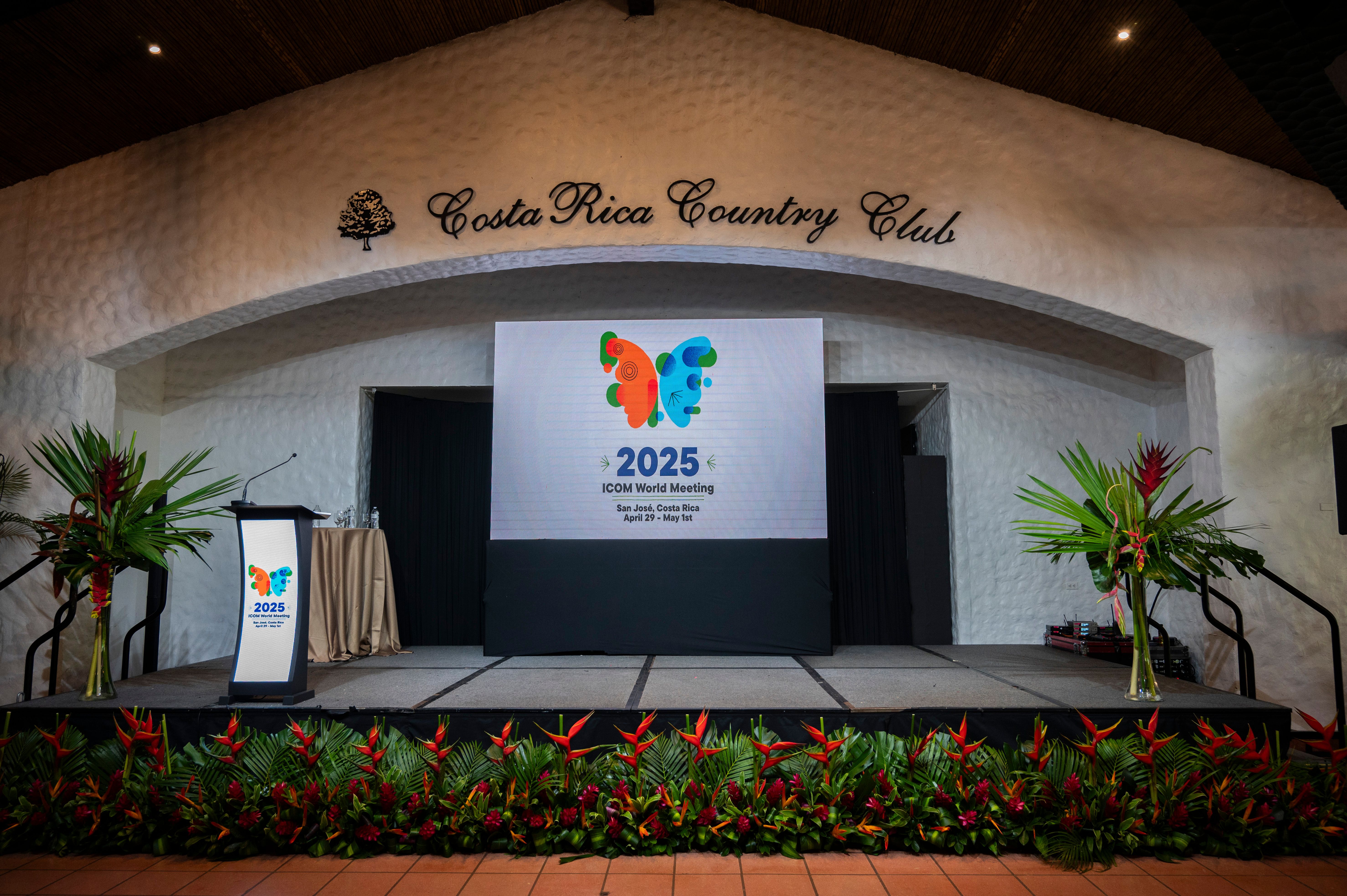
Mari was determined to marry the theme with Costa Rica’s greatest distinction — our vibrant biodiversity. “We’re extremely proud of our environments,” Mari shared. “With 6% of the world’s species living here, it’s an essential part of our culture. The floral, fauna, and wildlife is the visual identity you see in so much of our country’s marketing and branding. So when I started thinking about what bravery looks like in the context of Costa Rica — my mind went to the Blue Morpho Butterfly.”
This stunning native species became the hero of the identity, pairing a unique beauty with an epic transformation. “The metamorphosis that a butterfly goes through is already symbolic, with a beauty that comes from stepping out of one’s comfort zone.” Mari explained. “But the Blue Morpho is extra special, boasting a bold and unforgettable presence. One side of its wings is subtle, with eye-like markings — the other is this bright, iridescent blue. It felt like the perfect metaphor for duality: resilience and brilliance.”
Step Two: Piecing Together the Puzzle
Obviously, the butterfly would make for a perfect event mascot, but a logo goes even deeper than that. It’s a symbol of the people it represents, not just a place or event. So Mari brainstormed how to reflect the collective energy of ICOM as a network of independent agencies transcending borders with the passions that unite us.
And how did she do that? Through geometric shapes.
“I used circles, curves, angles — elements that are usually part of something bigger,” she said. “And in this case, they would all be derived from the butterfly itself. The idea was to show how individual pieces can come together to form something powerful. Just like the ICOM network.”
The resulting hero logo was bold, flexible, and full of motion — a perfect foundation to build from.
Step Three: Make it Visually Versatile
From there, Mari expanded the world around the butterfly.
Using vibrant tones and textures drawn from tropical sunsets, rainforest greens, and native flora, she developed a full palette: Morpho blue, sunset orange, tropical green — grounded by deep midnight and bright white for additional contrast.
She also created a series of supporting visuals inspired by Costa Rica’s flowers, like the Guaria Morada and Heliconia, all built from the same shapes and textures as the butterfly.
“It became this really versatile system,” said Mari. “We could use those shapes in so many different ways for backgrounds, signage, printed guides, and more, ensuring everything felt cohesive but nothing felt repetitive.”
Step Four: Let It Fly
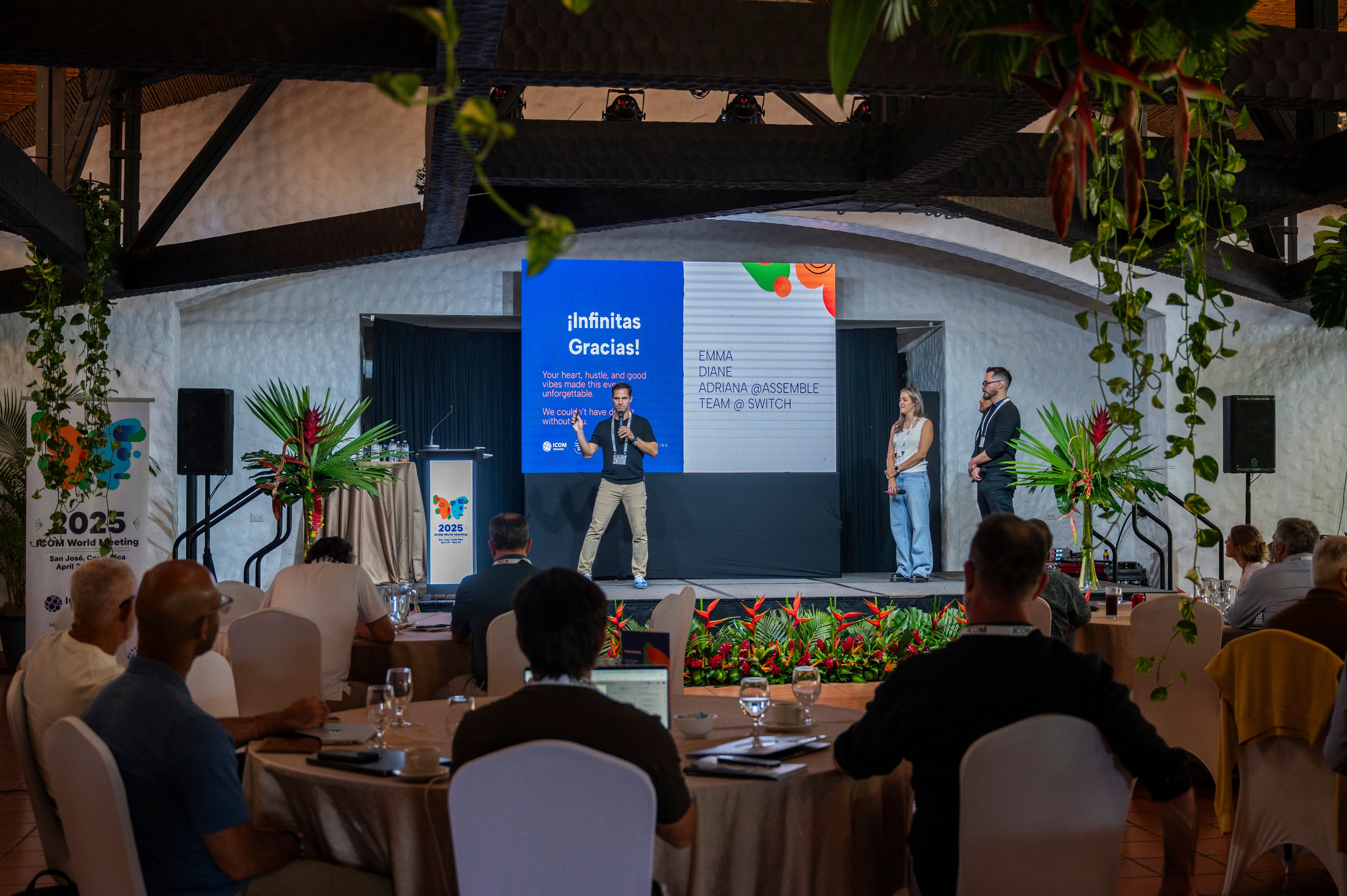
When we shared the branding with the ICOM community, the response was as electric as the design itself.
“People were thrilled and genuinely surprised,” Mari said. “They think of Assemble as the go-to production company, not really aware of the level of creative we can provide. It was not only super fun for me, but a great opportunity to really show what we can do in this area.”
It also sparked bigger conversations about the value of starting at the brand level, not just production. “This kind of foundational work — when you’re thinking about identity, meaning, and audience from the start — it sets the tone for everything else.”
Want to see the designs for yourself? You can check out the whole event brand guide here.
Beyond the Butterfly: What’s Next
Hosting the ICOM 2025 World Meeting was both an awesome challenge and a ton of fun. It required our team to double up their work loads and expand their bandwidths, while putting our creativity to all new tests.
This year’s theme asked all of us to lean into bold choices, embrace transformation, and lead with confidence, especially as AI reshapes our industry. And we loved welcoming such a smart, passionate, globally-minded crew to our home in Costa Rica and getting to shape an experience that was as vibrant, daring, and connected as the network itself.
As independent agencies, we’re uniquely equipped to navigate what’s next. And here at Assemble, we’re more excited than ever to support clients in doing just that; not just through production, but through bold, beautiful branding that sets the tone from day one.
Interested in hearing what we can do for you? Let’s talk branding, production, or ICOM. We’d love to hear from you.